In the realm of luxury packaging design, every detail matters. From the choice of materials to the finishing touches, each element plays a crucial role in conveying the essence of luxury and sophistication.
One aspect that holds particular importance in elevating the appeal of luxury packaging is the selection of print finishes. These finishes not only add visual interest but also enhance the tactile experience, leaving a lasting impression on the recipient.
In this guide, we explore some of the most exquisite print finishes that can be employed by luxury brands to create packaging design that resonates.
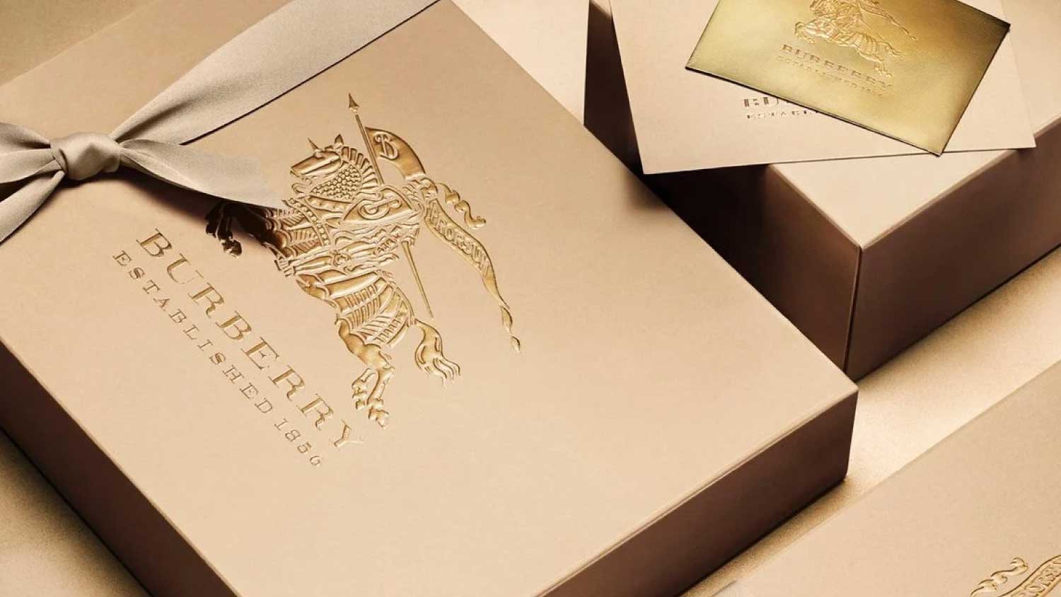
Embossed Gold Foiling
A versatile print finish for a majority of modern luxury brands – gold foiling is typically done very well, or particularly badly. Restraint needs to be exercised in the use of gold, and foiling where used should be of the highest quality and finish to compliment the brand.
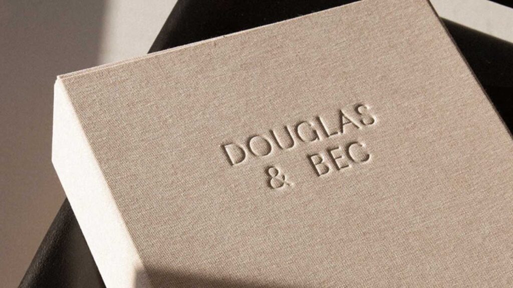
Blind Embossing
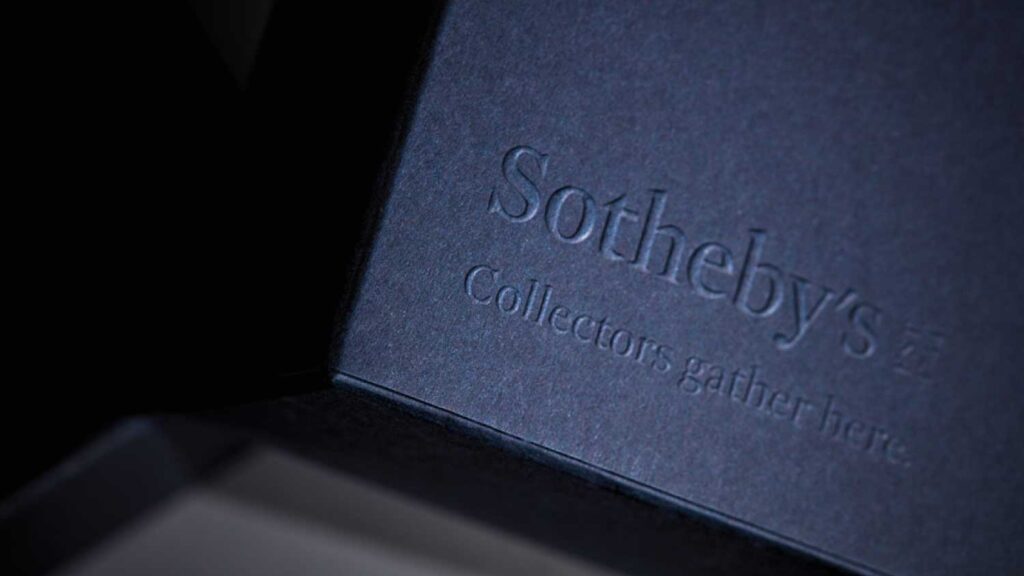
Blind embossing is the act of embossing a graphic or typography with no ink used. Restraint has to be used here to make sure that the embossing is legible and readable across typography and brand marks.
Blind Debossing
The inverse of embossing, is debossing – where a shape is pressed into a print surface. This works particularly well in presentation cases and hard-cover books.
Spot UV
Spot UV applications add a glossy treatment to the top of shapes and/or typography. Spot UV adds immediate texture and a feeling of layering and can be used with other print treatments to add depth and intrigue.
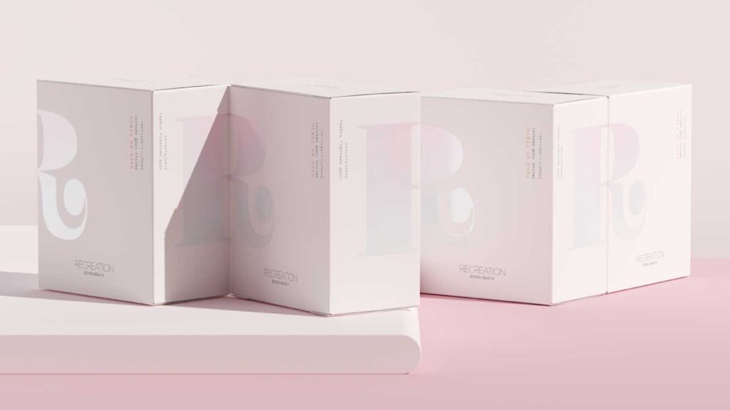
Pattern
Pattern and use of repetition is a key brand asset of a wealth of modern consumer luxury brands. Control must be used with pattern and a focus on scale, too big and the pattern doesn’t feel controlled or discerning, too small and the details and story of the pattern become lost.
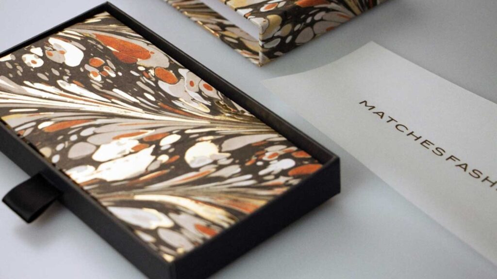
Colour Pops / Highlights
Adding a vibrant pop of colour in an unsual or unexpected place adds brand experience to packaging design.
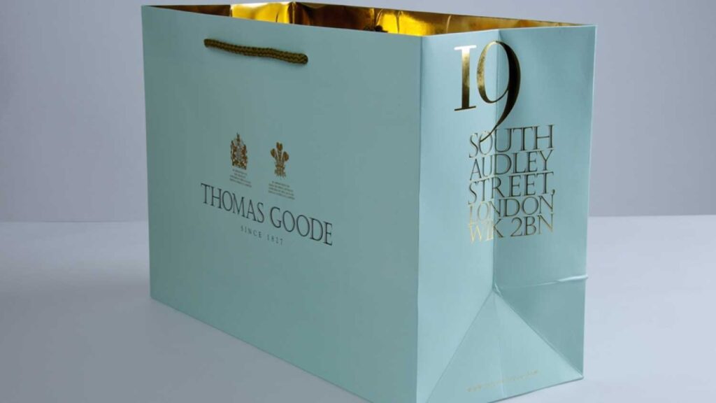
Minimalism
Focusing on your core brand colours and repeating them throughout packaging and inserts in a high quality textural stock may be all your brand needs to scream quiet luxury.
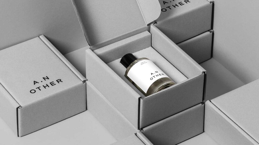
Tone On Tone
Making use of tone on tone colours (the same colours) has an effortless confidence.
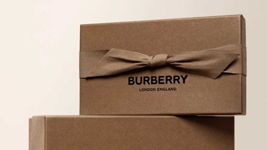
Layering
Layering multiple luxurious print treatments is the true meaning of maximalism.
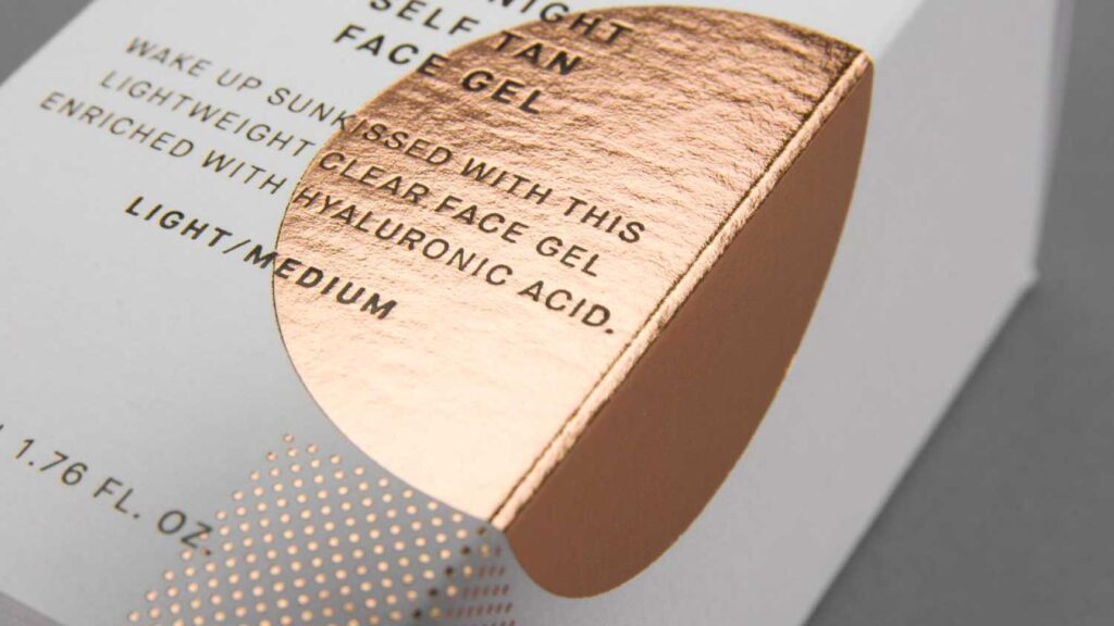
Single Bold Colour
Drilling down into your brands core colours, commiting to them and going bold is a key strategy in jewellery and fashion brands (Cartier Red, Tiffany Aqua).
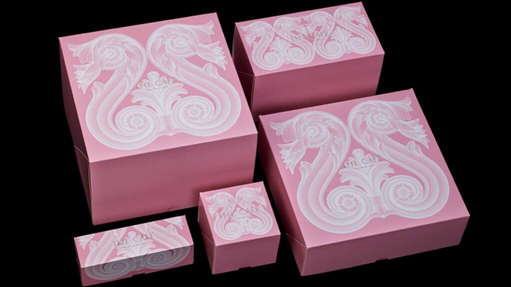
Ribbons
Adding texture to packaging design, ribbons and fabric adornments will always remind us of gifting, unboxing, delight and surprise.
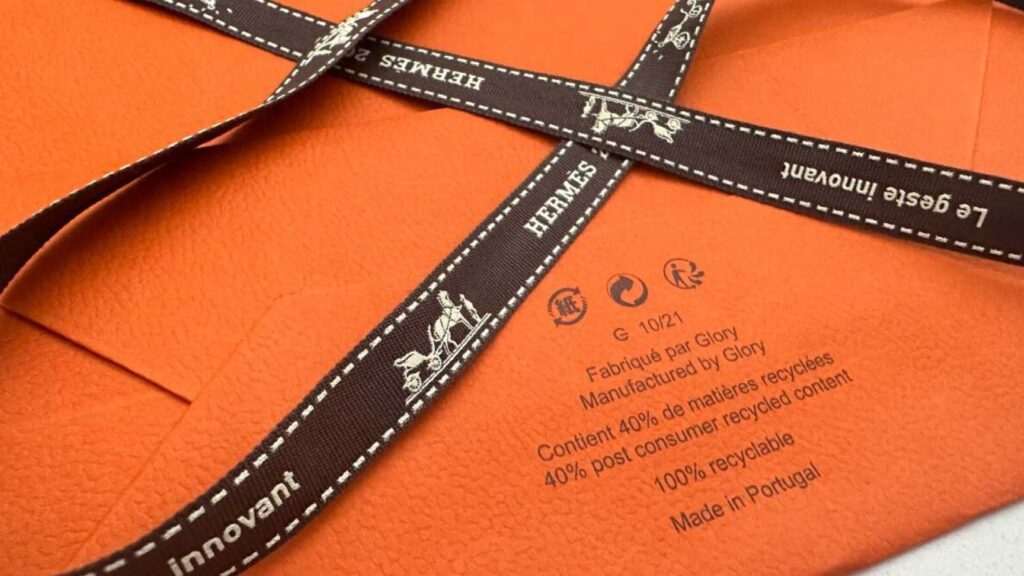
Contrast
Contrast can also be utilised to emphasise control and luxury minimalism.
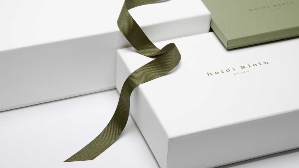
Blind Emboss Illustrations
Blind emboss can also be used to add textural detailing to illustrations and works particularly well for anything floral.
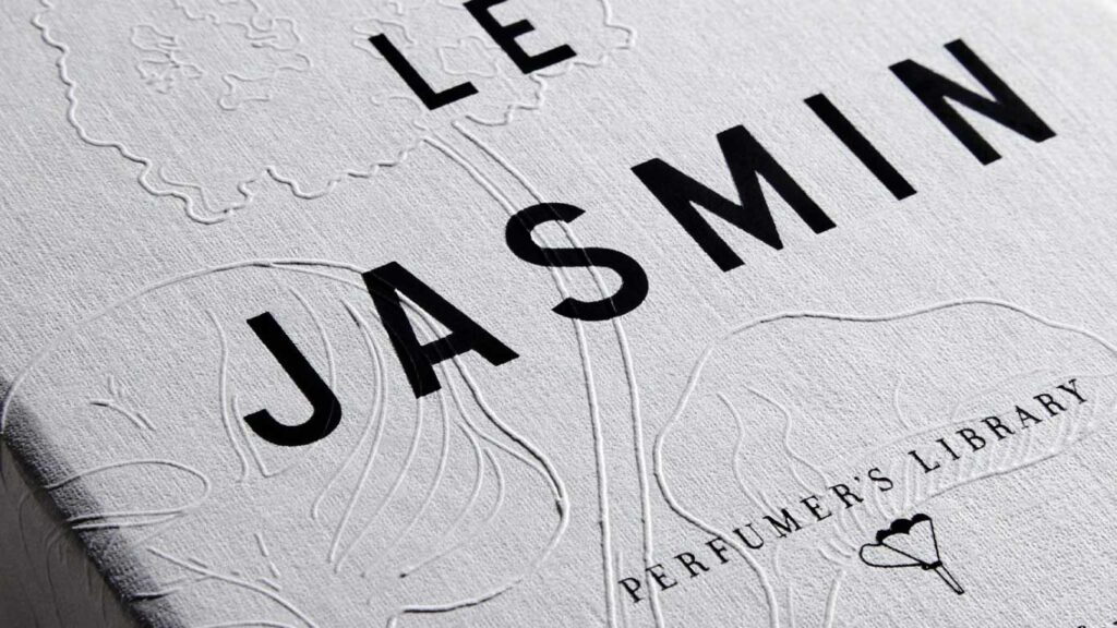
Textured Papers
Textured and hammered papers are an immediate way to add layers of intrigue and occasion to packaging design.
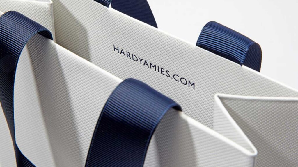
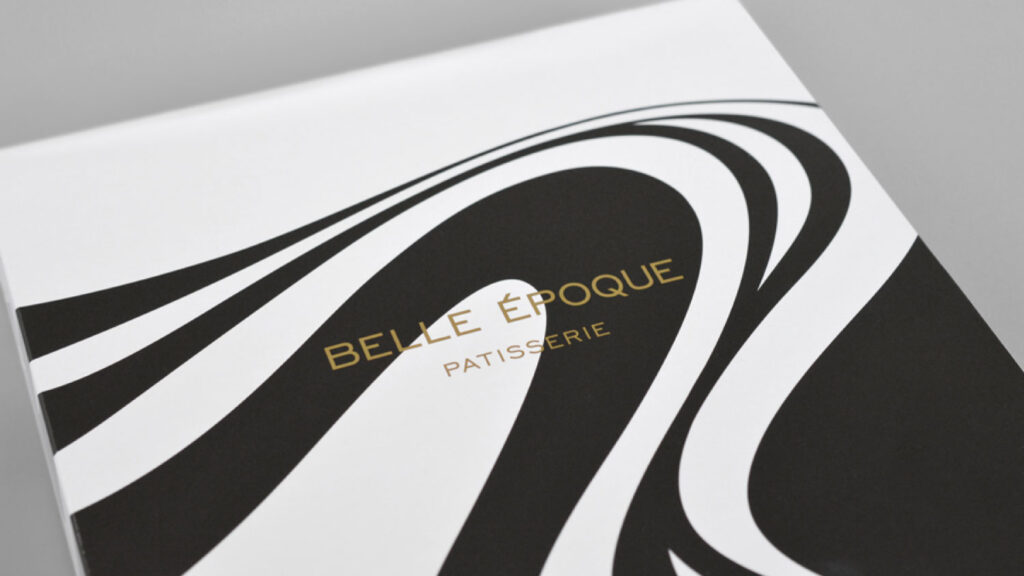
Black & White
Use of Black & White can offer a timeless approach to luxury packaging design.
Packaging design projects now have an overwhelming amount of print finishes to create one of a kind packaging concepts which resonate with consumers. The key is in control and knowing when and where to use them.
Daniel Hinde (Hide And Line)

